The basics of Web design
I quite regularly got questions from people about the way to design a website: don’t get me wrong, I am not a professional Web designer, I mean I am not dedicated to Web design. I do love it, and I do think I have some (modest) skills, but I am an engineer before anything else.
Anyway, people still ask me about Web design and I am going to try to explain what are the few basic steps that get me to the kind of final result you can see right now:
- I usually start thinking about the basic layout: nothing definite, just how many columns, what are the main proportions, where is gonna be the menu…
- Then it’s time for some procrastination: I keep drawing some really rough drafts, ideas and notes about what I could do. By putting this to paper, I get to see most of the mistakes I could have done,
- When I have a good idea of what I actually want to build, I need to choose a color scheme. I used to rely on a lot of different tools such as the wellstyled.com Color Schemes Generator, ColorJack or ColorSchemer. You can choose to go for 2, 3, 4 colors, mono, contrast, triad, tetrad schemes; you can find websites explaining those concepts better than I could do. I must say though that I now use exclusively Kuler from Adobe Labs: good tool, useful features and wide community of users. Just give it a try: you’ll get hooked too. You can also trust your bare eyes, or use a picture, but using those tools usually ensure your colors work well together.
-
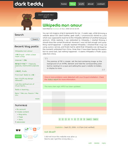
I now roughly know what’s the layout and what are the colors: time to open Photohop, Gimp, Illustrator or any kind of CAP software you’re familiar with and start playing with what you’ve gathered so far. I won’t give you any particular advice on that (there is no such thing as a “Design a website in 5 mn with Photoshop” tutorial), just try to keep it clean, use rules, groups and understandable names for layers. I usually end up with a mockup page containing all the graphical elements of a typical page of my site, something like that:

- Once I am satisfied with my mockup, I need to convert this static image into a bunch of CSS files and pics. I actually already think about this step when designing the mockup; with experience come the knowledge of what is easy to do with CSS (and well-formed markup) and what is not. Once again I am not gonna give you a CSS tutorial, ressources a numerous.
- Well that’s the last step: design is implemented and functional. I now go from section to section and add what was not taken into account by the mockup, or correct what doesn’t work. I also spend a HUUUUUUUUGE amount of time correcting all rendering bugs in IE. I usually develop my designs under Firefox and then adapt it to work with all the other major browsers: Opera, Safari, IE… It’s pretty sad, but even with most of the market share, IE still is, sorry for my French, A BIG PAIN IN THE ASS! Hopefully bugs are now well documented and solved (when possible). And don’t let me start on IE7…
Well, that’s pretty much all, things are not more complex. For those lacking of inspiration, there are plenty of websites listing great looking sites (way better than a furry geek like me could do): CSS Remix, CSS Manua, CSS Drive, CSS Beauty… Just try to keep it original.